Hallway Test:
Forgot Password
Background
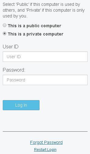
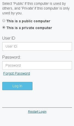
While working with a third party vendor on a project to replace the login process, a question arose as to the best location for the “Forgot Password” link to be displayed on the login screen. Two options were available “out of the box” by the provider: directly underneath the “Password” field, or within the footer. The Forgot Password screen always required the User ID to be entered, even when it had already been entered on the main Login screen.
My Responsibilities (Entire Project)
- Identify all potential “out of the box” configurations, including screen flow, control location and text
- Determine which configurations require adjustment in order to best optimize the user experience
- Document all screen configuration changes, including the rationale for each
- Document the best screen flow to be implemented
- Create two Frequently Asked Questions (FAQ) documents, one for each distinct user base - home office and field office - to simplify the transition to this new process and as an introduction to each new feature
- Design and implement the web page to launch each of three login utilities - Multi-factor Authentication (MFA) enrollment, Modify MFA enrollments, Change Password
- Communicate all changes and timelines to all impacted users
Team
- Researchers: 1
- Test Participants: 24
Timeframe
- Summer 2019
- 1 day
Platforms/Devices
Paper Prototypes
- Login screen with Option A link location
- Login screen with Option B link location
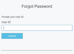
- Forgot Password screen
Research Question
How does the on-screen location of the “Forgot Password” link influence the user’s expectations of the “Forgot Password” function?
Considerations
METHOD
- Screens had not yet been configured on the test network.
- Ability to test without computer access was critical.
- My decisions needed to be informed by user input quickly.
SAMPLE
- Participants were necessarily limited to internal employees as time and budget were not available for in-person field or remote usability studies.
- As employees would be as impacted by these login changes as remote users would be, and this study covered only one single use case, all users were deemed to be representative of the target audience.
TEST LIMITATIONS
- Once this new system went live, it would only be possible to reset a forgotten password online for users that were enrolled in MFA (Multi-Factor Authentication).
- Since MFA would be new to our systems and could potentially have distracted from the original research question, this component was not introduced as a part of these test scenarios.
Rationale
- Forgot Password was a new function that was not available online on previous system
- Limited research scope
- Lack of budget for other research methods
- Short timeframe
Process
SAMPLE TYPE
- Convenience, from multiple internal departments – selected based on availability
- Participants were approached in the hallways, in a break room, or at their desk.
SCENARIO
- Participants were asked if they would be willing to participate in a short research study that would take no more than 5 minutes of their time.
- The study was prefaced as a test of potential screens, and not a test of the participant.
- Each participant was then handed a piece of paper displaying a high fidelity mock-up of one of the two potential Login screens (below).
- The participant was asked to speak aloud the steps they would take on this screen.
- After each user spoke to the completion of the User ID field, I added to the scenario that he or she could not remember the Password, and I asked for their next step(s).
- When the participant indicated that they would click the "Forgot Password" link, a second screen mock-up was handed to the user:
Captured Data
QUANTITATIVE
- Time on Task - How long it took each user to locate and verbally indicate they would click the Forgot Password link.
QUALITATIVE
- Body Language
- Verbal indications of disappointment with having to re-enter the User ID
Findings
- On average, it took slightly less time for participants to locate the Forgot Password link when it was placed directly underneath the Password field.
- No participant demonstrated a negative reaction - verbally or non-verbally - to entering the User ID twice, on two different screens
- Two respondents said that they would call the Help Desk (which was, at the time, the only available option with the current login process) and were consequently never shown the first Forgot Password screen.
Potential Influences
It is expected that the paper prototypes may not have triggered the same reaction to the duplicate User ID entry scenario as an interactive prototype may have.
Results and Potential Next Steps
- The Forgot Password link was placed directly underneath the Password field (Version 1), and the new login processes were implemented in Production in late January 2000.
- I consulted the help desk on a weekly basis to identify any negative reaction to the location of the Forgot Password link.
- If it had been determined that the current location of this link incorrectly set the expectation that a User ID already entered on the initial login screen should be carried over to the Forgot Password screen, moving the link to the footer was a simple configuration that could have been implemented quickly - this was not found to be the case.
DROP ME A LINE
Like what you see? Let's get in touch!
Diana Criser, CUA, CXA
User Experience Practitioner
Omaha, Nebraska
User Experience Practitioner
Omaha, Nebraska
402.598.4969


